


Updated at: 2022-12-09 03:49:50
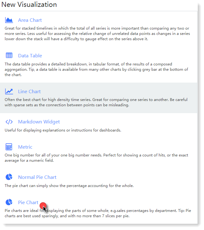
AnyRobot provides a wide range of visualization types to meet the visual analysis needs in different scenarios. You can create different types of visualization by log group or saved search, and then click View to see the visualization display.
The example shows total VMware virtual machines and the proportion of every department in a data center by applying pie chart.
1. Click Visualization in the navigation bar to enter Create New Visualization page, where you can select the appropriate chart type. In this example, select Pie Chart;
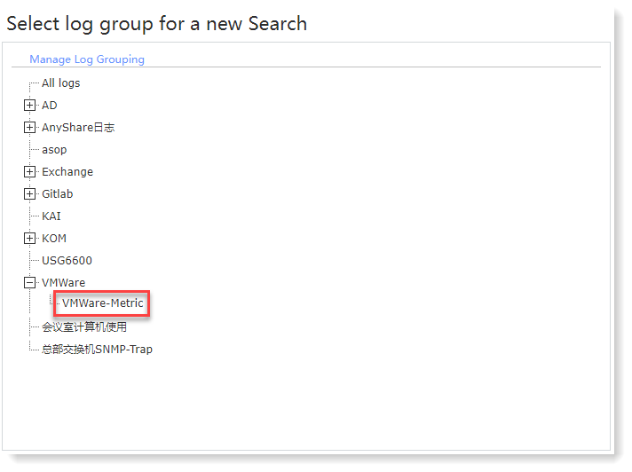
2. Enter the interface of Select Log Grouping or Stored Search, where you can screen log data sources that need to be visually aggregated and displayed. In this example, in the log grouping list, click the VMWare-Metric log grouping created before, and then jump into the visual chart parameter configuration, as follows:
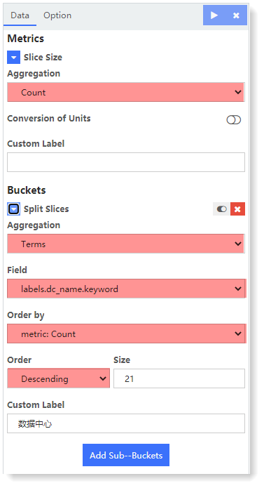
3. In the configuration page, you can complete the configuration of Metric and Bucket parameters as required. In this example, the configuration parameters are as follows:
• Metric: In this example, you can count total virtual machines in the data center, Aggregation way as Count;
• Bucket: Except total virtual machines, you can also count every department virtual machine numbers and proportions, therefore, you can set Buckets Aggregation way as Terms, set the term as labels.dc_name.keywordset, listing in a descending order.
4. Click to generate the current visual chart on the right page, as follows:
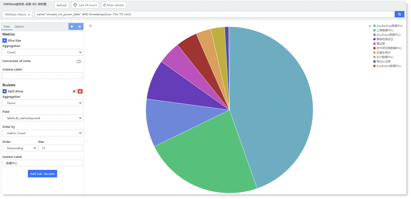
4. Click Save to save it.
The example shows total VMware virtual machines and the proportion of every department in a data center by applying pie chart.
1. Click Visualization in the navigation bar to enter Create New Visualization page, where you can select the appropriate chart type. In this example, select Pie Chart;
2. Enter the interface of Select Log Grouping or Stored Search, where you can screen log data sources that need to be visually aggregated and displayed. In this example, in the log grouping list, click the VMWare-Metric log grouping created before, and then jump into the visual chart parameter configuration, as follows:
3. In the configuration page, you can complete the configuration of Metric and Bucket parameters as required. In this example, the configuration parameters are as follows:
• Metric: In this example, you can count total virtual machines in the data center, Aggregation way as Count;
• Bucket: Except total virtual machines, you can also count every department virtual machine numbers and proportions, therefore, you can set Buckets Aggregation way as Terms, set the term as labels.dc_name.keywordset, listing in a descending order.
4. Click
to generate the current visual chart on the right page, as follows:4. Click Save to save it.
< Previous:
Next: >