


Updated at: 2022-12-09 03:49:50
It is to visualize the percentage relationship of each component to the whole. Pie chart supports split chart method to refine and split pie charts according to aggregation fields. The specific steps are as follows:
1. Click Visualization > Pie Chart to select data sources. You can filter out the required data sources by selecting Log Group or Saved Search;
2. Make pie chart visualization editing, and configure parameters as follows:
1) Configure Metric parameters:
• Aggregation: Select the type of aggregation for the fan part of Pie Chart: Count (default), Sum, and Unique Count;
• Conversion of Units: Set the conversion from original units to target units, and you can enable/disable this function;
• Custom Tag: Set the name displayed on the fan part
2) Buckets: Classify bucket aggregation on the selected fields and display the split pie chart:
• Buckets Type: Split Chart, Split Slice;
• Aggregation: Available types: Date Histogram, Histogram, Range, Date Range, IPv4 Range, Terms, Filters, Significant Terms.
3. After completing the above configuration, click the button at the top left to check the visual view on the right, as follows:
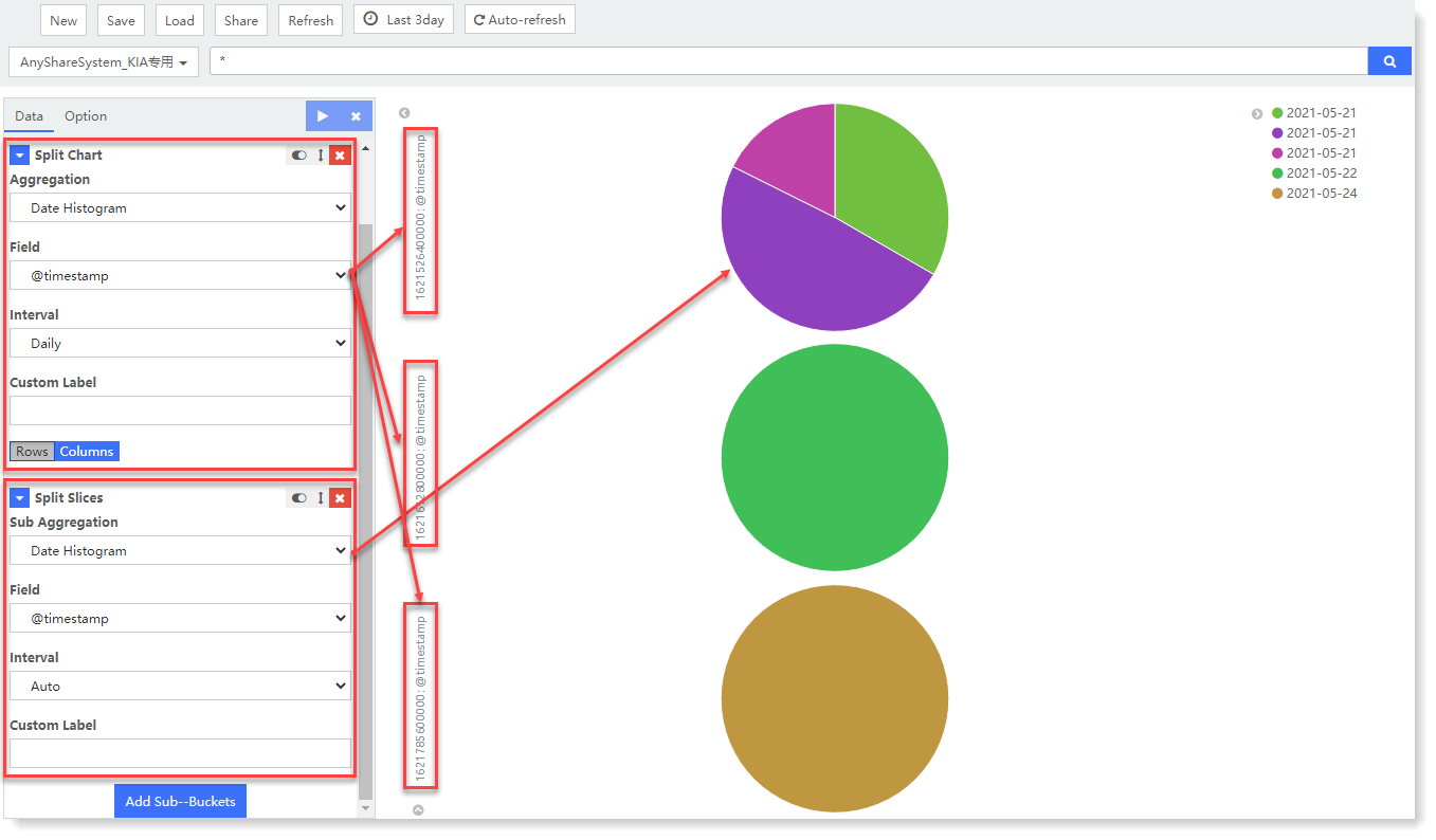
_15.png) Note: After adding the Split Chart bucket aggregation parameters, you need to continue to add the Split Slice aggregation bucket. After successful execution, you can view the Split Chart effect.
Note: After adding the Split Chart bucket aggregation parameters, you need to continue to add the Split Slice aggregation bucket. After successful execution, you can view the Split Chart effect.
In the above example, through Split Chart, the log data count results are split into two Pie Charts for display according to the aggregation field @timestamp. Through Split Slice, a single Pie Chart is sliced according to the aggregation field count, and the top 5 count field values are displayed statistically by counting.
4. After visual view configuration, click Save to complete the current visual view creation.
1. Click Visualization > Pie Chart to select data sources. You can filter out the required data sources by selecting Log Group or Saved Search;
2. Make pie chart visualization editing, and configure parameters as follows:
1) Configure Metric parameters:
• Aggregation: Select the type of aggregation for the fan part of Pie Chart: Count (default), Sum, and Unique Count;
• Conversion of Units: Set the conversion from original units to target units, and you can enable/disable this function;
• Custom Tag: Set the name displayed on the fan part
2) Buckets: Classify bucket aggregation on the selected fields and display the split pie chart:
• Buckets Type: Split Chart, Split Slice;
• Aggregation: Available types: Date Histogram, Histogram, Range, Date Range, IPv4 Range, Terms, Filters, Significant Terms.
3. After completing the above configuration, click the
button at the top left to check the visual view on the right, as follows: Note: After adding the Split Chart bucket aggregation parameters, you need to continue to add the Split Slice aggregation bucket. After successful execution, you can view the Split Chart effect.In the above example, through Split Chart, the log data count results are split into two Pie Charts for display according to the aggregation field @timestamp. Through Split Slice, a single Pie Chart is sliced according to the aggregation field count, and the top 5 count field values are displayed statistically by counting.
4. After visual view configuration, click Save to complete the current visual view creation.
< Previous:
Next: >