


Updated at: 2022-12-09 03:49:50
This data visualization tool can combine completely independent data sources in a single visualization. Timelion expression language is used to create Timing Diagram which is mostly used to retrieve time-series data, perform calculations to sort out answers to complex questions and visualize the results. The specific steps are as follows:
1. Click Visualization > Timing Diagram to select data sources. You can filter out the required data sources by selecting Log Group or Saved Search;
2. Make timing diagram visualization editing, and configure parameters as follows:
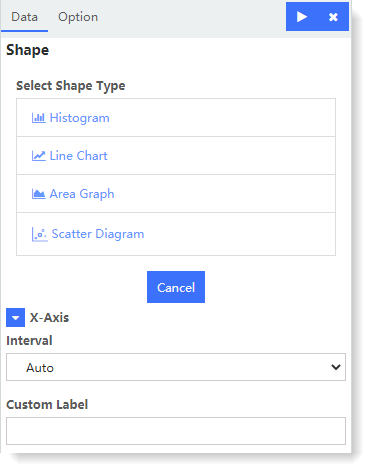
► Configure chart parameters: Multiple chart types can be added to a timing diagram
• Chart Type: Histogram, Line Chart, Scatter Diagram and Area Graph;
• Saved Search: To configure chart parameters, you need to select the saved search to determine the aggregation data source;
• Aggregation: Count, Avg, Sum, Min, Max, Unique Count;
• Field: Set the fields to be aggregated for the chart;
• Time Deviation: Set the time deviation range based on the current time: No Deviation / Previous 1 Hour / Previous 1 Day / Previous 1 Week / Previous 1 Month / Previous 1 Year / Custom;
• Y-Axis Position: Set the display position of Y axis, and the default is Y1/Y2/Y3
► X-Axis: The X-Axis of the Timing Diagram is classified by Time Interval.
3. After completing the above configuration, click the button at the top left to check the visual view on the right, as follows:
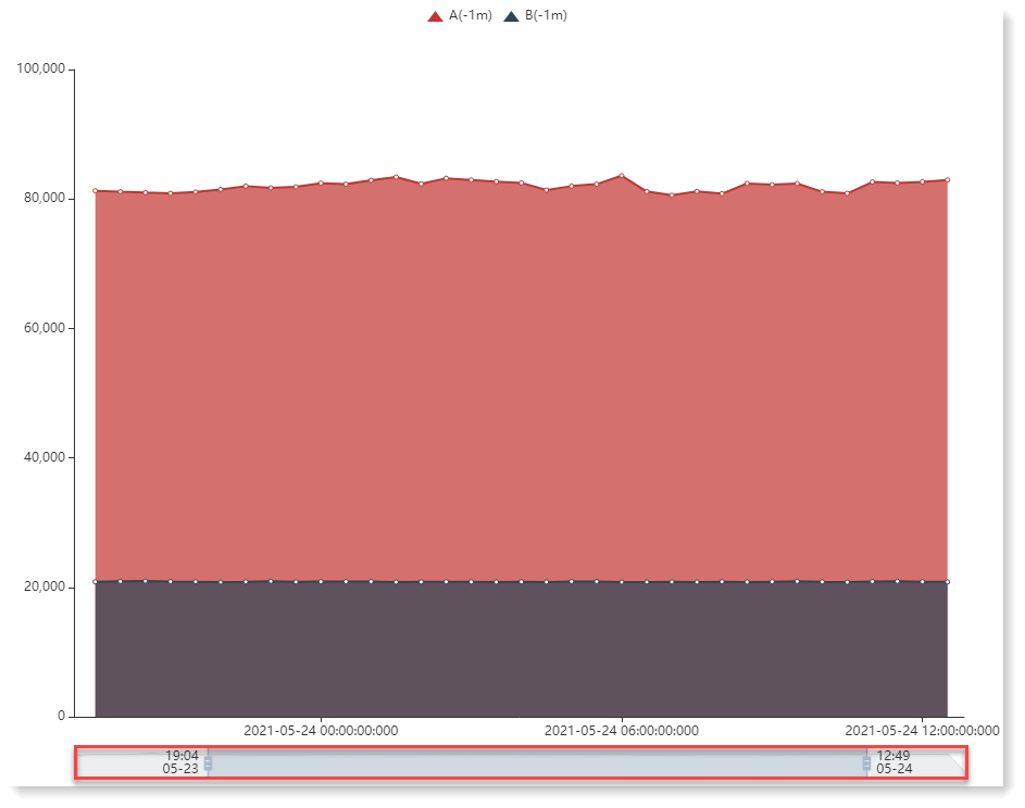
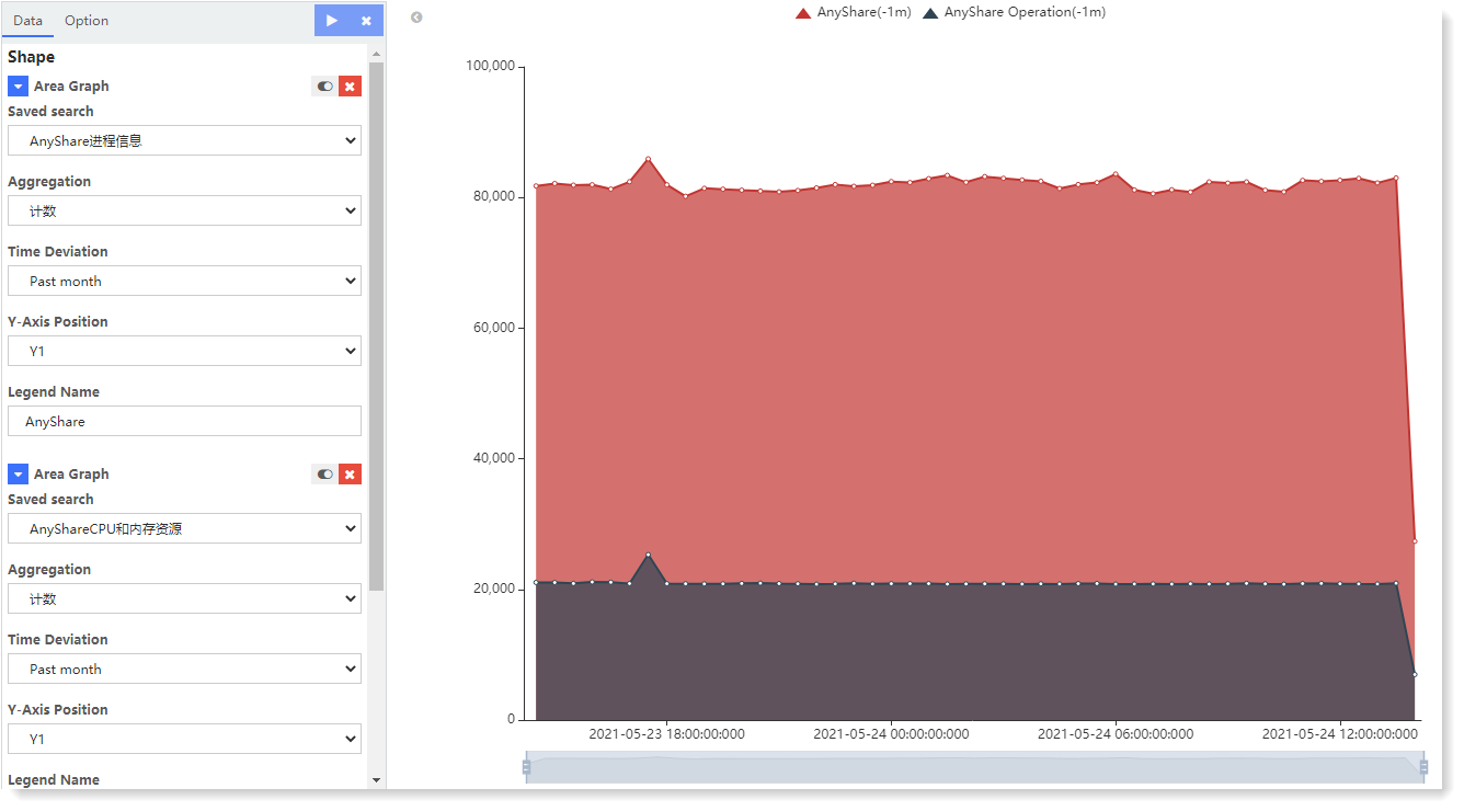 In the above example, two chart types are used to aggregate different log data and classify the data according to Time Intervals. Contrast can be realized in the same view. Drag the timeline below to adjust the time display interval parameters, as follows:
 4. Click Save to complete the current visual view creation.
1. Click Visualization > Timing Diagram to select data sources. You can filter out the required data sources by selecting Log Group or Saved Search;
2. Make timing diagram visualization editing, and configure parameters as follows:
► Configure chart parameters: Multiple chart types can be added to a timing diagram
• Chart Type: Histogram, Line Chart, Scatter Diagram and Area Graph;
• Saved Search: To configure chart parameters, you need to select the saved search to determine the aggregation data source;
• Aggregation: Count, Avg, Sum, Min, Max, Unique Count;
• Field: Set the fields to be aggregated for the chart;
• Time Deviation: Set the time deviation range based on the current time: No Deviation / Previous 1 Hour / Previous 1 Day / Previous 1 Week / Previous 1 Month / Previous 1 Year / Custom;
• Y-Axis Position: Set the display position of Y axis, and the default is Y1/Y2/Y3
► X-Axis: The X-Axis of the Timing Diagram is classified by Time Interval.
3. After completing the above configuration, click the
button at the top left to check the visual view on the right, as follows: In the above example, two chart types are used to aggregate different log data and classify the data according to Time Intervals. Contrast can be realized in the same view. Drag the timeline below to adjust the time display interval parameters, as follows:4. Click Save to complete the current visual view creation.
< Previous:
Next: >