


Updated at: 2022-12-09 03:49:50
The area chart is suitable for showing the total value trend of all time series, and the specific configuration is as follows:
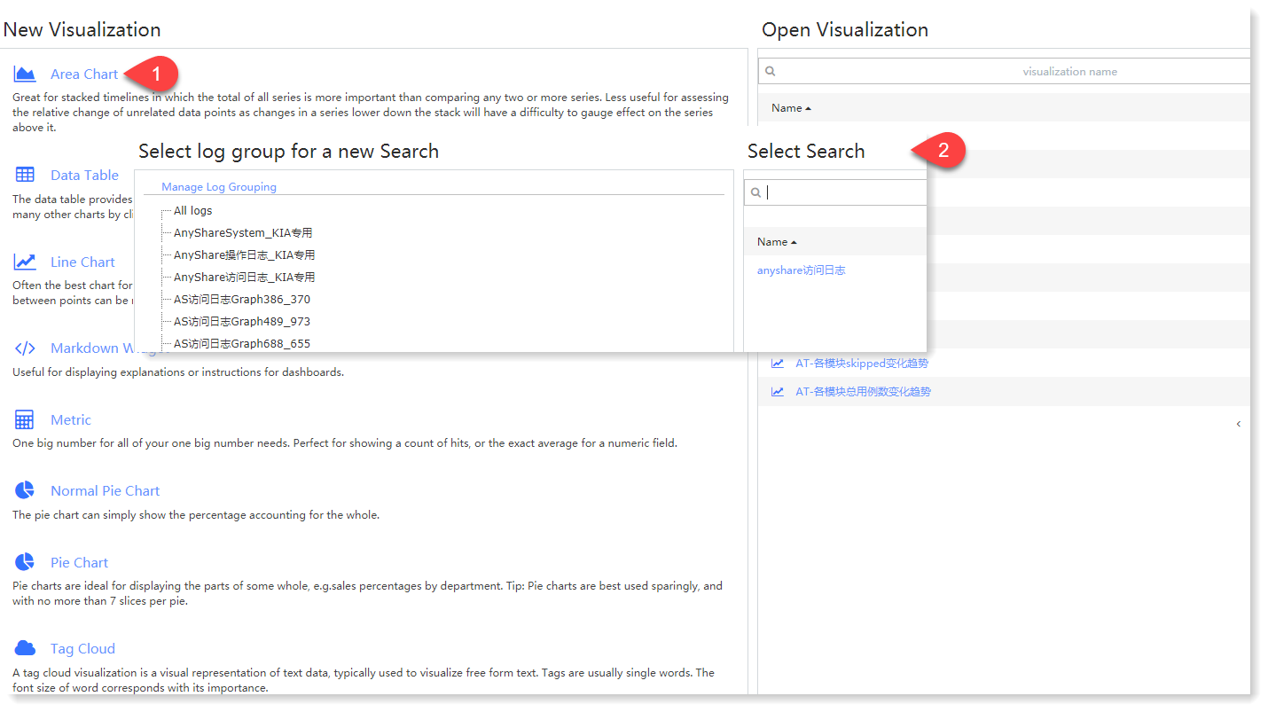
1. Click Visualization > Area Chart to select data sources. You can filter out the required data sources by selecting Log Group or Saved Search, as follows:
 2. Make Area Chart visualization editing, and configure parameters as follows:
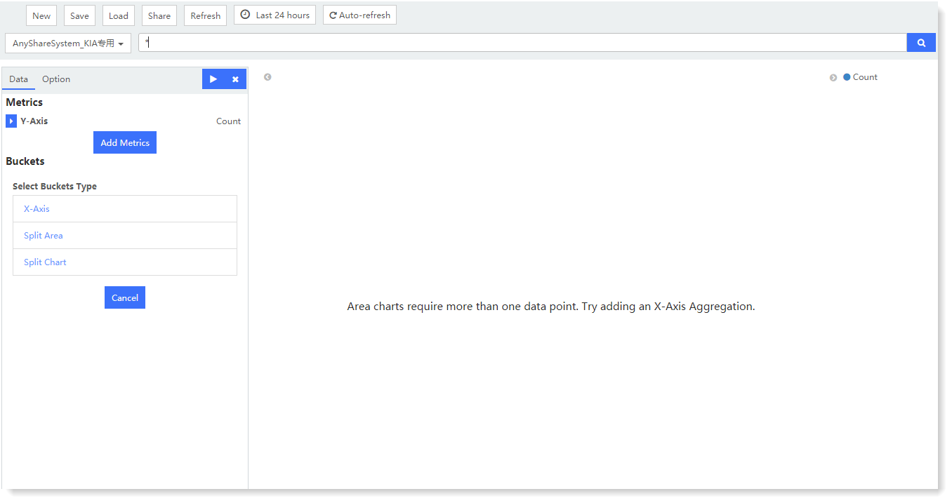 1) Metrics - Y axis: One or multiple metric aggregation types can be added;
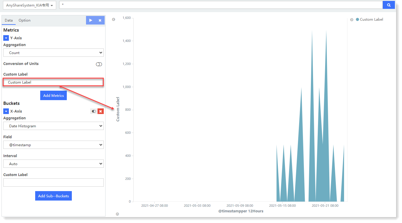
• Aggregation: Select the type of aggregation for the y-axis: Count (default), Avg, Sum, Median, Min, Max, Unique Count, Percentiles, Percentile Ranks
• Conversion of Units: Set the conversion from original units to target units, and you can enable/disable this function.
• Custom Tag: Set the axis name displayed on the Y axis, as follows:
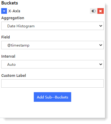
 2) Buckets - X axis: Classify bucket aggregation on field values according to the selected fields:
• Select Buckets Type: Set the type of bucket: X-Axis, Split Area, Split Chart;
• Aggregation: Available types: Date Histogram, Histogram, Range, Date Range, IPv4 Range, Terms, Filters, Significant Terms;
• Field: Set the fields to be aggregated;
• Custom Tag: Set the axis name displayed on the X axis
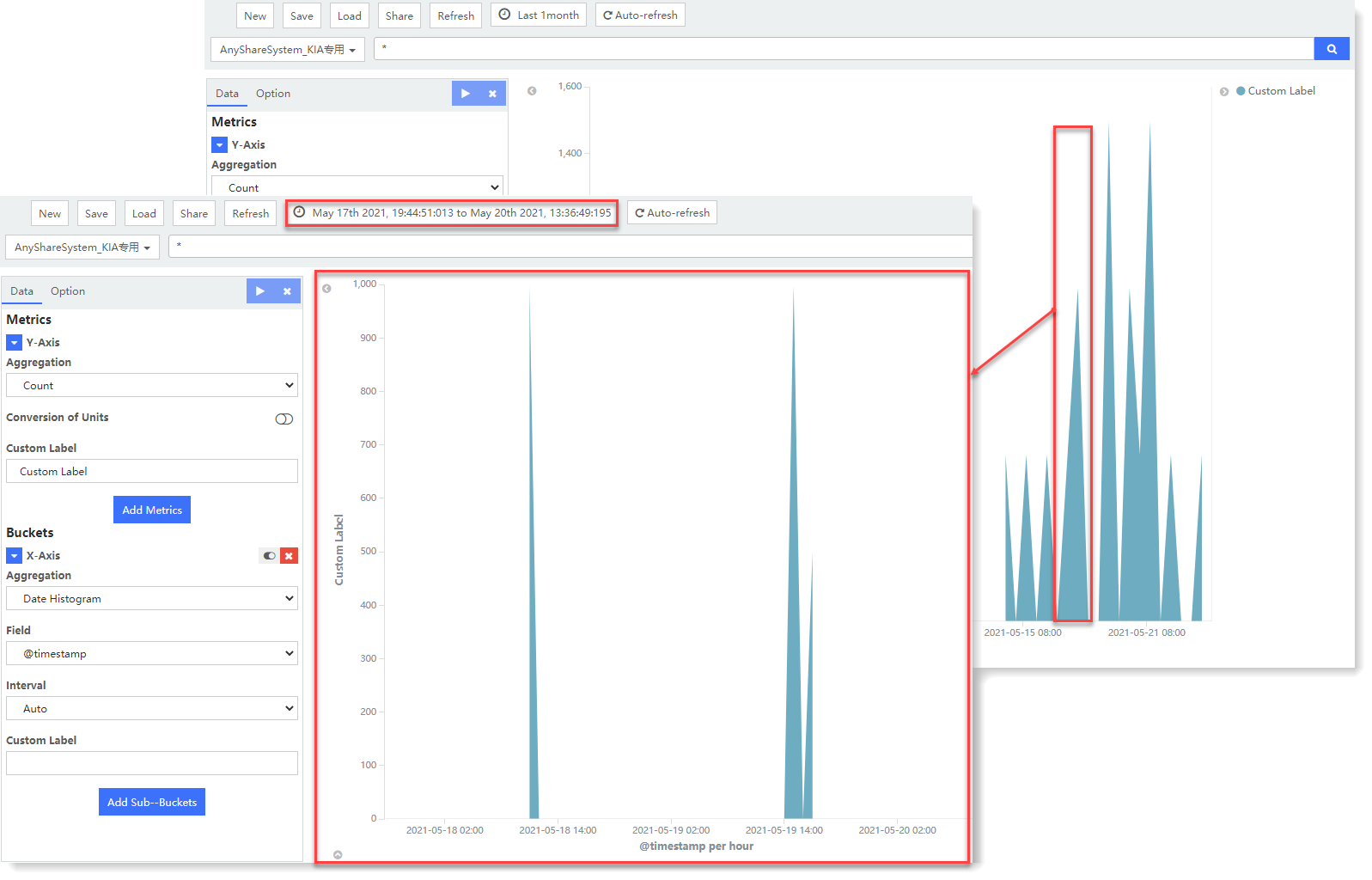
3. After completing the above configuration, click the button at the top left to check the visual view on the right, as follows:
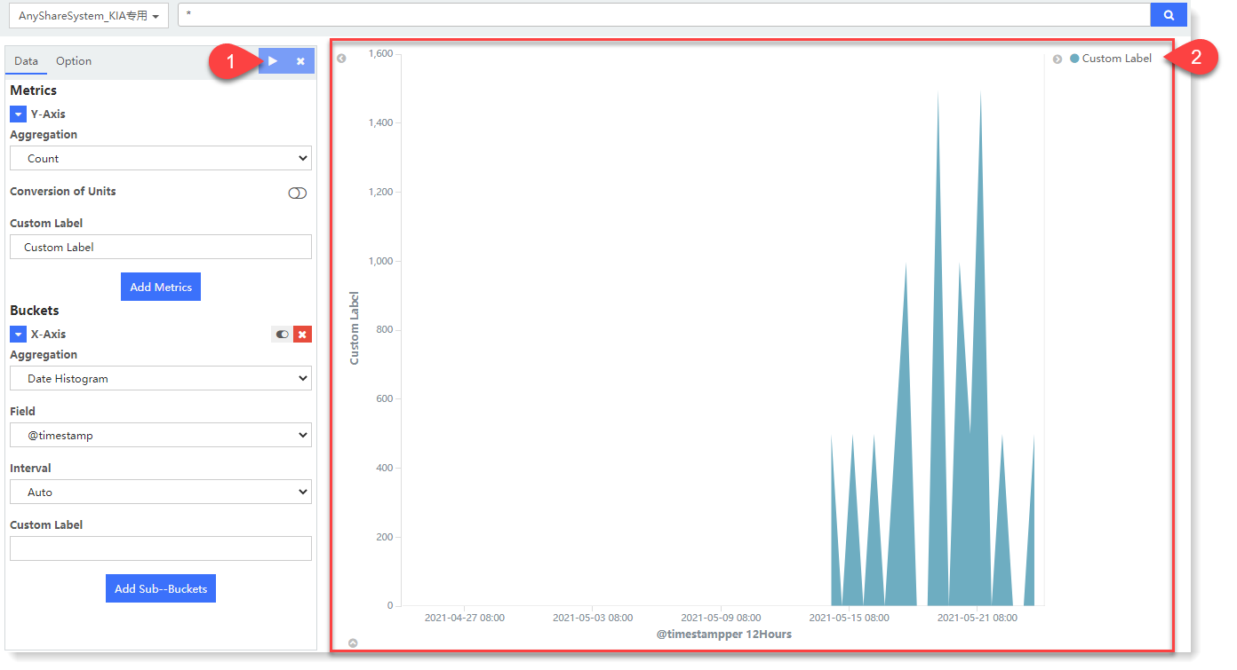 Selected view area to count the aggregation value of log data in the selected time period, as follows:
 4. After visual view configuration, click Save to complete the current visual view creation.
1. Click Visualization > Area Chart to select data sources. You can filter out the required data sources by selecting Log Group or Saved Search, as follows:
2. Make Area Chart visualization editing, and configure parameters as follows: 1) Metrics - Y axis: One or multiple metric aggregation types can be added;• Aggregation: Select the type of aggregation for the y-axis: Count (default), Avg, Sum, Median, Min, Max, Unique Count, Percentiles, Percentile Ranks
• Conversion of Units: Set the conversion from original units to target units, and you can enable/disable this function.
• Custom Tag: Set the axis name displayed on the Y axis, as follows:
2) Buckets - X axis: Classify bucket aggregation on field values according to the selected fields: • Select Buckets Type: Set the type of bucket: X-Axis, Split Area, Split Chart;
• Aggregation: Available types: Date Histogram, Histogram, Range, Date Range, IPv4 Range, Terms, Filters, Significant Terms;
• Field: Set the fields to be aggregated;
• Custom Tag: Set the axis name displayed on the X axis
3. After completing the above configuration, click the
button at the top left to check the visual view on the right, as follows: Selected view area to count the aggregation value of log data in the selected time period, as follows:4. After visual view configuration, click Save to complete the current visual view creation.
< Previous:
Next: >