


Updated at: 2022-12-09 03:49:50
It is suitable for presenting key indicator data. The specific steps are as follows:
1. Click Visualization > Dashboard to select data sources. You can filter out the required data sources by selecting Log Group or Saved Search;
2. Make dashboard visualization editing, and configure parameters as follows:
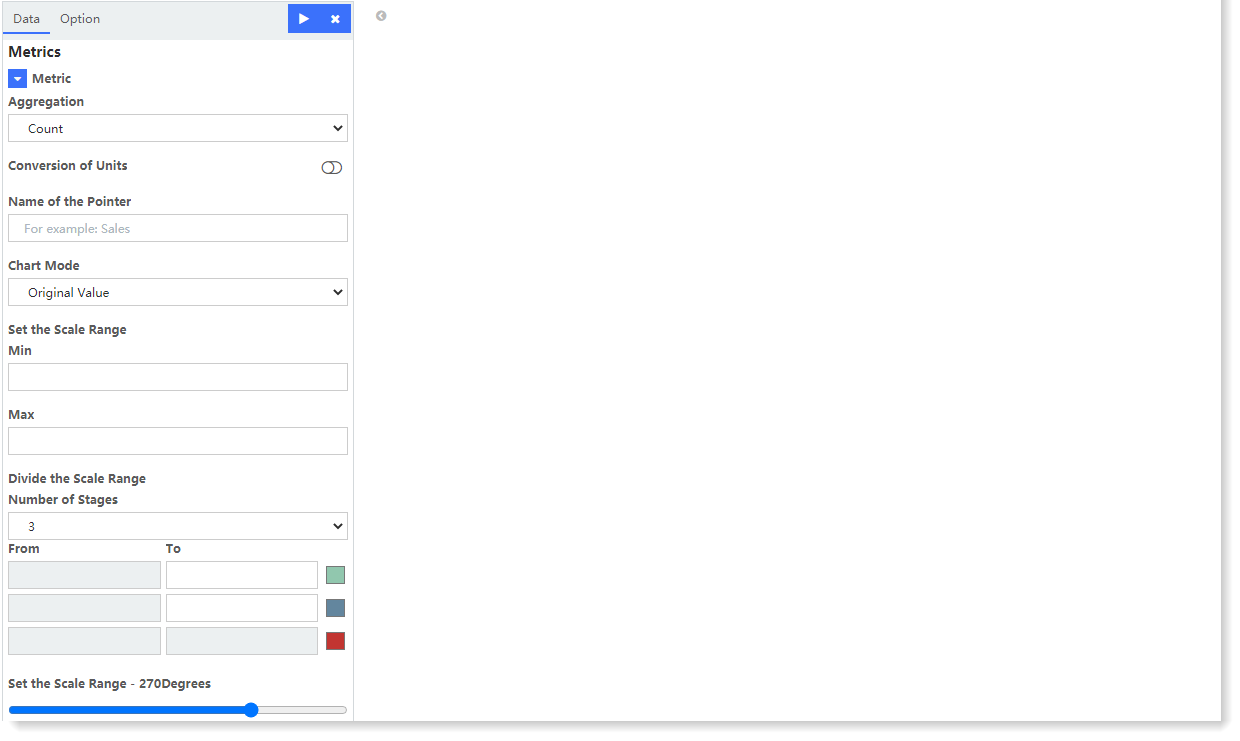 • Aggregation: Select the aggregation type for the set Metric: Count (default), Avg, Sum, Median, Min, Max, Unique Count, Top N;
• Conversion of Units: Set the conversion from original units to target units, and you can enable/disable this function;
• Name of the Pointer: Set the display name of dashboard;
• Chart Mode: Set the display in the original numerical mode or in the percentage mode;
• Set the Scale Range: Set the maximum and minimum scale values of dashboard;
• Divide the Scale Range: Select the Number of Stages to automatically divide the scale values according to the selected number, and you can customize the color of each stage;
• Set the Scale Range: Set the angle range of the dashboard presented in the dashboard view.
3. After completing the above configuration, click the button at the top left to check the visual view on the right, as follows:
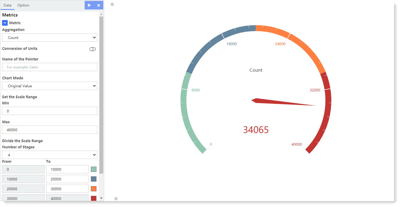
The above example is a 270-degree car dashboard for the number of log entries in all log groups.
4. Click Save to complete the current visual view creation.
1. Click Visualization > Dashboard to select data sources. You can filter out the required data sources by selecting Log Group or Saved Search;
2. Make dashboard visualization editing, and configure parameters as follows:
• Aggregation: Select the aggregation type for the set Metric: Count (default), Avg, Sum, Median, Min, Max, Unique Count, Top N;• Conversion of Units: Set the conversion from original units to target units, and you can enable/disable this function;
• Name of the Pointer: Set the display name of dashboard;
• Chart Mode: Set the display in the original numerical mode or in the percentage mode;
• Set the Scale Range: Set the maximum and minimum scale values of dashboard;
• Divide the Scale Range: Select the Number of Stages to automatically divide the scale values according to the selected number, and you can customize the color of each stage;
• Set the Scale Range: Set the angle range of the dashboard presented in the dashboard view.
3. After completing the above configuration, click the
button at the top left to check the visual view on the right, as follows: The above example is a 270-degree car dashboard for the number of log entries in all log groups.
4. Click Save to complete the current visual view creation.
< Previous:
Next: >