


Updated at: 2022-12-09 03:49:50
It can be used in a variety of scenarios, either for timeline or non-timeline visualization, as follows:
1. Click Visualization > Histogram to select data sources. You can filter out the required data sources by selecting Log Group or Saved Search;
2. Make histogram visualization editing, and configure parameters as follows:
1) Metrics - Y axis: One or multiple metric aggregation types can be added;
• Aggregation: Select the type of aggregation for the Y axis: Count (default), Avg, Sum, Median, Min, Max, Unique Count, Percentiles, Percentile Ranks;
• Conversion of Units: Set the conversion from original units to target units, and you can enable/disable this function;
• Custom Tag: Set the axis name displayed on the Y axis
2) Buckets: Classify bucket aggregation on field values according to the selected fields:
• Bucket Type: X-Axis, Split Bar, Split Chart;
• Aggregation: Available types: Date Histogram, Histogram, Range, Date Range, IPv4 Range, Terms, Filters, Significant Terms.
3. After completing the above configuration, click the button at the top left to check the visual view on the right, as follows:
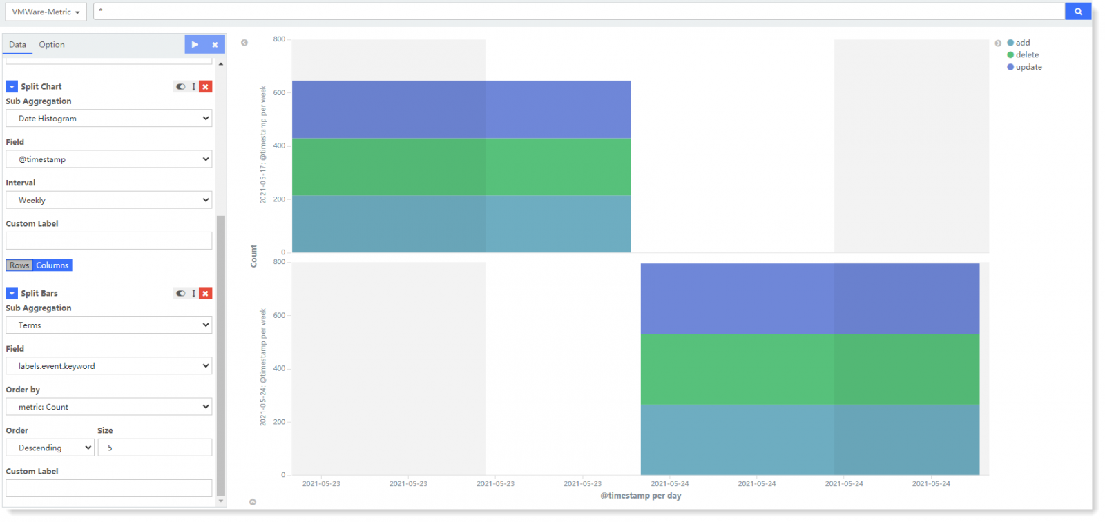
In the above example, through X-Axis bucket aggregation, the log data count results are performed with bucket aggregation according to the aggregation field @timestamp. Through Split Bar aggregation, a single columnar bar is divided into columns according to the aggregation field count, and the top 5 count field values are displayed statistically by counting. According to the aggregation field @ timestamp, the log data counting results are split into two histograms for display by Split Group aggregation.
4. Click Save to complete the current visual view creation.
1. Click Visualization > Histogram to select data sources. You can filter out the required data sources by selecting Log Group or Saved Search;
2. Make histogram visualization editing, and configure parameters as follows:
1) Metrics - Y axis: One or multiple metric aggregation types can be added;
• Aggregation: Select the type of aggregation for the Y axis: Count (default), Avg, Sum, Median, Min, Max, Unique Count, Percentiles, Percentile Ranks;
• Conversion of Units: Set the conversion from original units to target units, and you can enable/disable this function;
• Custom Tag: Set the axis name displayed on the Y axis
2) Buckets: Classify bucket aggregation on field values according to the selected fields:
• Bucket Type: X-Axis, Split Bar, Split Chart;
• Aggregation: Available types: Date Histogram, Histogram, Range, Date Range, IPv4 Range, Terms, Filters, Significant Terms.
3. After completing the above configuration, click the
button at the top left to check the visual view on the right, as follows: In the above example, through X-Axis bucket aggregation, the log data count results are performed with bucket aggregation according to the aggregation field @timestamp. Through Split Bar aggregation, a single columnar bar is divided into columns according to the aggregation field count, and the top 5 count field values are displayed statistically by counting. According to the aggregation field @ timestamp, the log data counting results are split into two histograms for display by Split Group aggregation.
4. Click Save to complete the current visual view creation.
< Previous:
Next: >