


Updated at: 2022-12-09 03:49:50
The line chart is suitable for high-density time series, more suitable for comparing 2 series, with specific steps as follows:
1. Click Visualization > Line Chart to select data sources. You can filter out the required data sources by selecting Log Group or Saved Search;
2. Make Line Chart visualization editing, and configure parameters as follows:
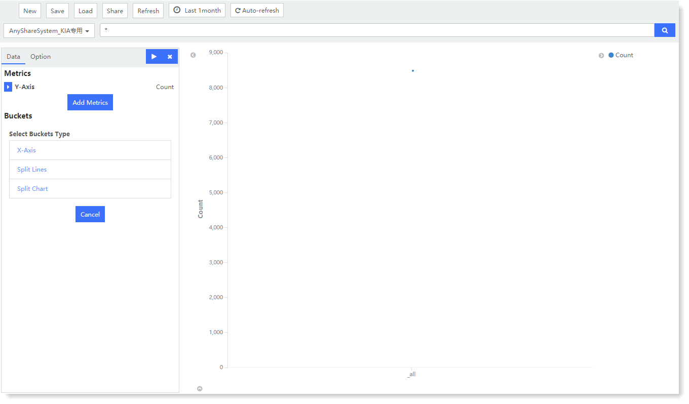
1) Metrics - Y axis: One or multiple metric aggregation types can be added;
• Metrics: You can select Y-Axis, Dot Size. Among them, Dot Size refers to the aggregation value given by aggregating each numerical dot on the line chart;
• Aggregation: Select the type of aggregation for the y-axis: Count (default), Avg, Sum, Median, Min, Max, Unique Count, Percentiles, Percentile Ranks;
• Conversion of Units: Set the conversion from original units to target units, and you can enable/disable this function;
• Custom Tag: Set the axis name displayed on the Y axis
2) Buckets - X axis: Classify bucket aggregation on field values according to the selected fields:
• Select Bucket Type: You can select X-Axis, Split Lines or Split Charts;
• Aggregation: Available types: Date Histogram, Histogram, Range, Date Range, IPv4 Range, Terms, Filters, Significant Terms;
• Field: Set the fields to be aggregated;
• Custom Tag: Set the axis name displayed on the X axis
3. After completing the above configuration, click the button at the top left to check the visual view on the right, as follows:
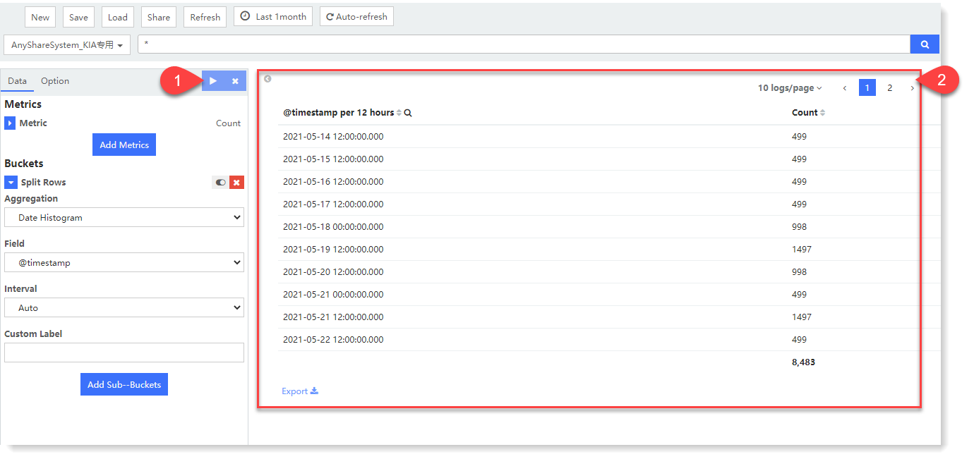
In the above example, the count field values are performed with dot aggregation in the Metric aggregation, and the aggregation type is Count. Hover over a certain numerical dot, the aggregation value of Y axis and count dot aggregation can be viewed in the prompt message at the same time.
4. For the generated chart, you can also switch to Option and set the following parameters:
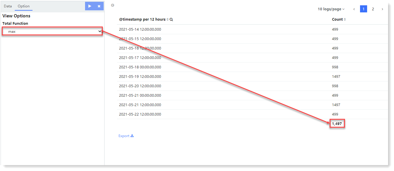
• Text Scale: linear, log, and square root. Exponentially varying data can be displayed on the logarithmic scale, such as compound interest charts. Data sets with large differences in values can be displayed on the square root scale.
• Show Connecting Line: Data dots are connected by line;
• Show Circles: Data dots are plotted as a small circle.
_15.png) Note: For other general configurations of view options, please refer to the section Generic Function of View .
Note: For other general configurations of view options, please refer to the section Generic Function of View .
5. After visual view configuration, click Save to complete the current visual view creation.
1. Click Visualization > Line Chart to select data sources. You can filter out the required data sources by selecting Log Group or Saved Search;
2. Make Line Chart visualization editing, and configure parameters as follows:
1) Metrics - Y axis: One or multiple metric aggregation types can be added;
• Metrics: You can select Y-Axis, Dot Size. Among them, Dot Size refers to the aggregation value given by aggregating each numerical dot on the line chart;
• Aggregation: Select the type of aggregation for the y-axis: Count (default), Avg, Sum, Median, Min, Max, Unique Count, Percentiles, Percentile Ranks;
• Conversion of Units: Set the conversion from original units to target units, and you can enable/disable this function;
• Custom Tag: Set the axis name displayed on the Y axis
2) Buckets - X axis: Classify bucket aggregation on field values according to the selected fields:
• Select Bucket Type: You can select X-Axis, Split Lines or Split Charts;
• Aggregation: Available types: Date Histogram, Histogram, Range, Date Range, IPv4 Range, Terms, Filters, Significant Terms;
• Field: Set the fields to be aggregated;
• Custom Tag: Set the axis name displayed on the X axis
3. After completing the above configuration, click the
button at the top left to check the visual view on the right, as follows: In the above example, the count field values are performed with dot aggregation in the Metric aggregation, and the aggregation type is Count. Hover over a certain numerical dot, the aggregation value of Y axis and count dot aggregation can be viewed in the prompt message at the same time.
4. For the generated chart, you can also switch to Option and set the following parameters:
• Text Scale: linear, log, and square root. Exponentially varying data can be displayed on the logarithmic scale, such as compound interest charts. Data sets with large differences in values can be displayed on the square root scale.
• Show Connecting Line: Data dots are connected by line;
• Show Circles: Data dots are plotted as a small circle.
Note: For other general configurations of view options, please refer to the section Generic Function of View .5. After visual view configuration, click Save to complete the current visual view creation.
< Previous:
Next: >